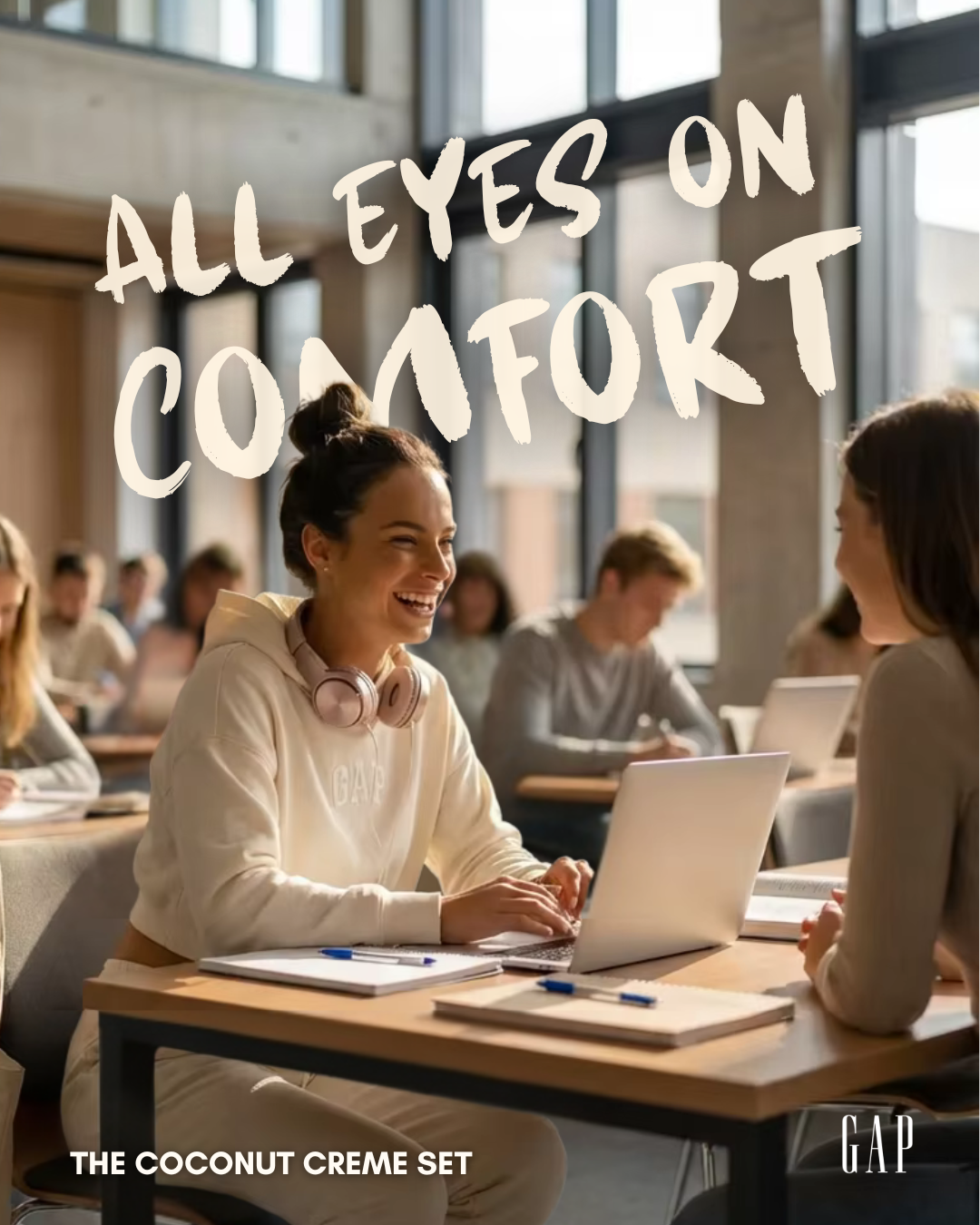
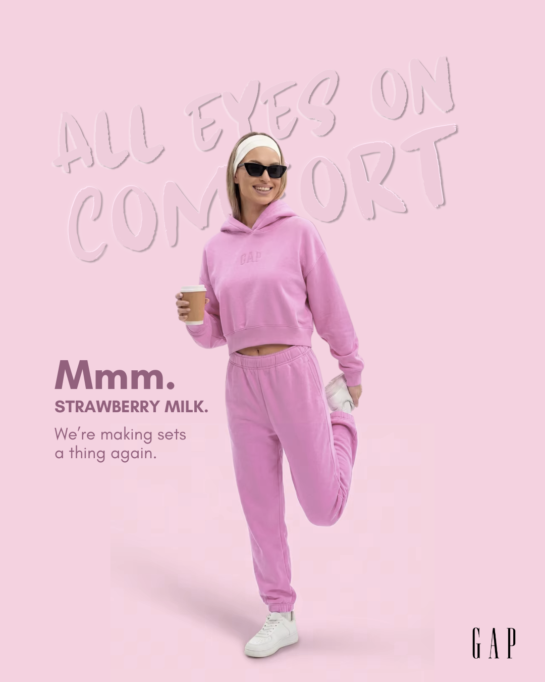
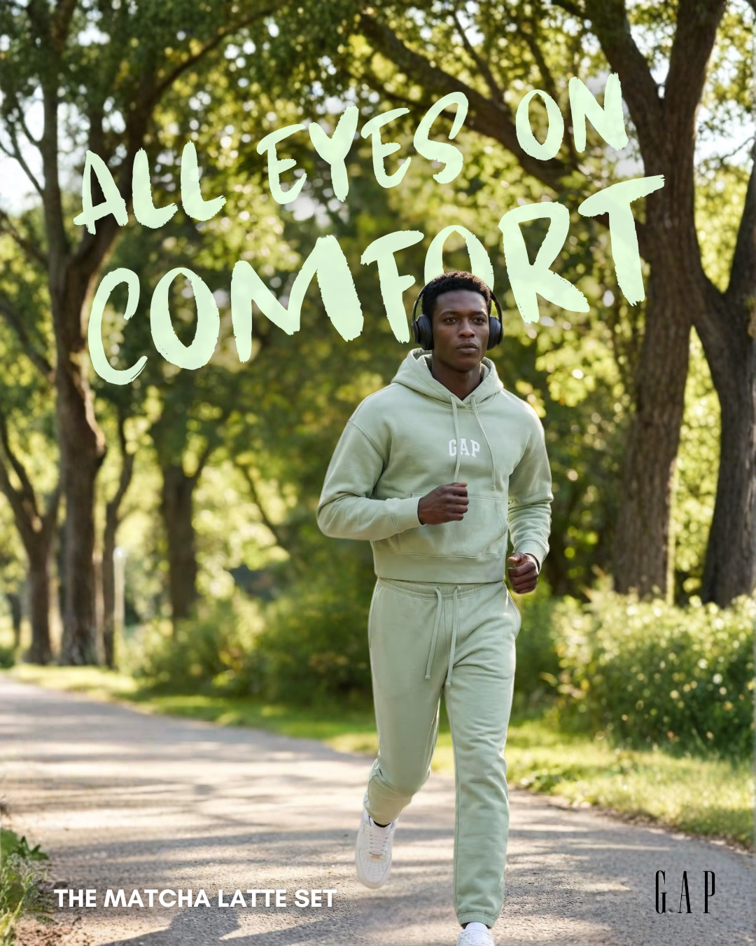
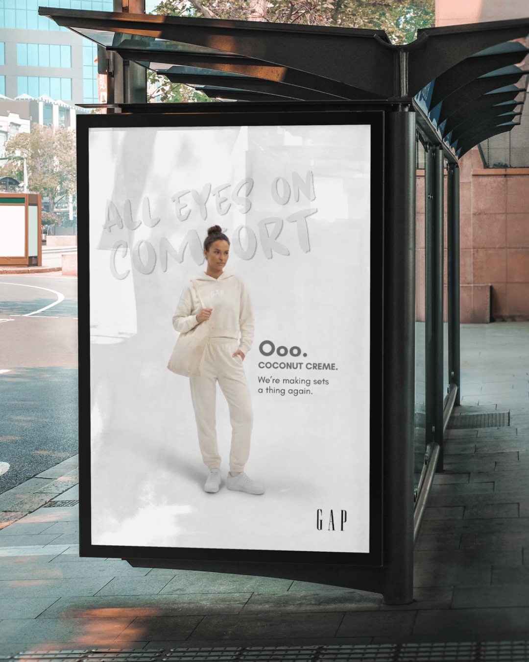
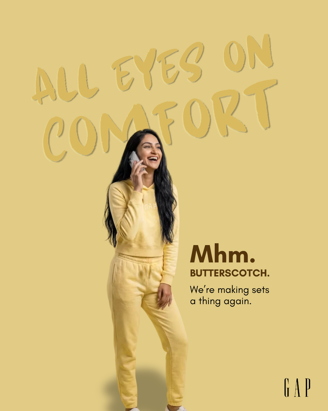
Our objective was to reposition Gap beyond denim and reconnect with Gen-Z. We shifted focus to sweat sets, recognizing that comfort is no longer a fallback but a core part of everyday identity. The campaign, “All Eyes on Comfort.”, reframed sweats as the default outfit, effortless, expressive, and worth being seen in. By combining sensory, personality driven naming with elevated visuals, we positioned Gap as the brand that makes comfort the main character.
Store Display
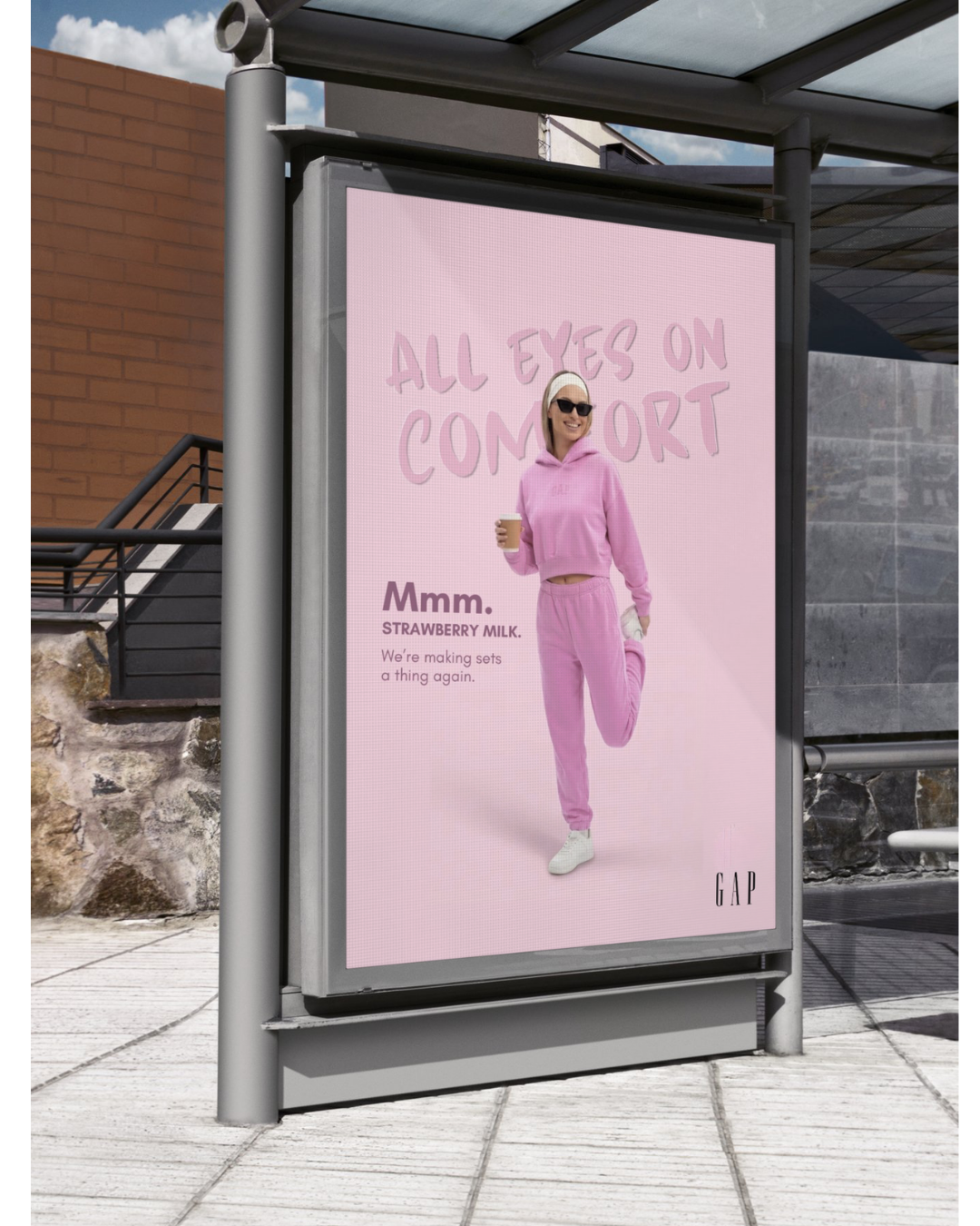
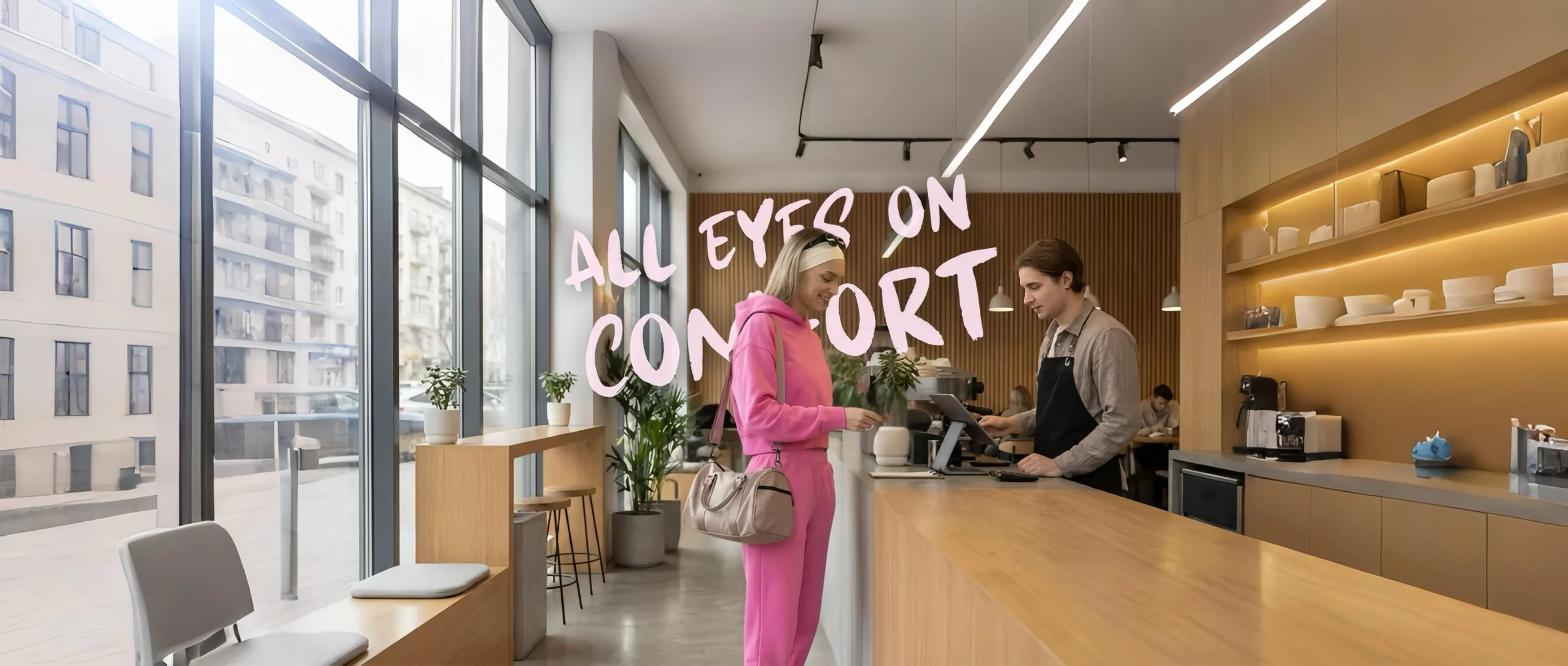
Transit
Placed in high-traffic transit spaces, this work targets audiences in routine moments where comfort matters most. The design uses soft color blocking, minimal elements, and large-scale typography to ensure visibility and quick comprehension, while the sensory copy reinforces the feeling of ease.
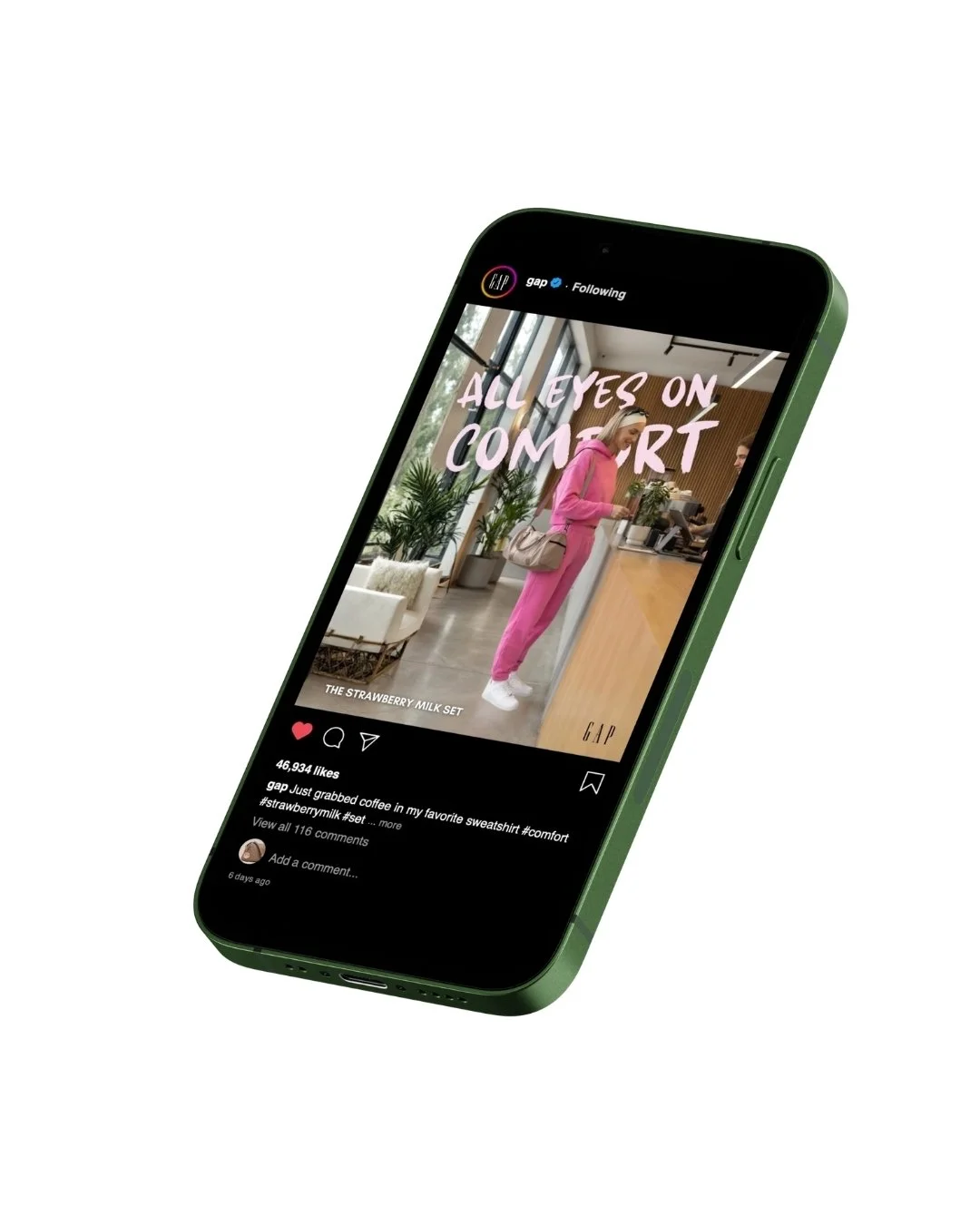
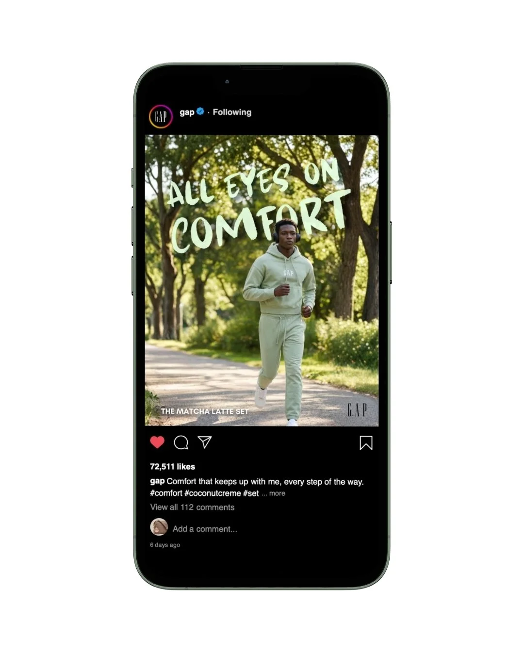
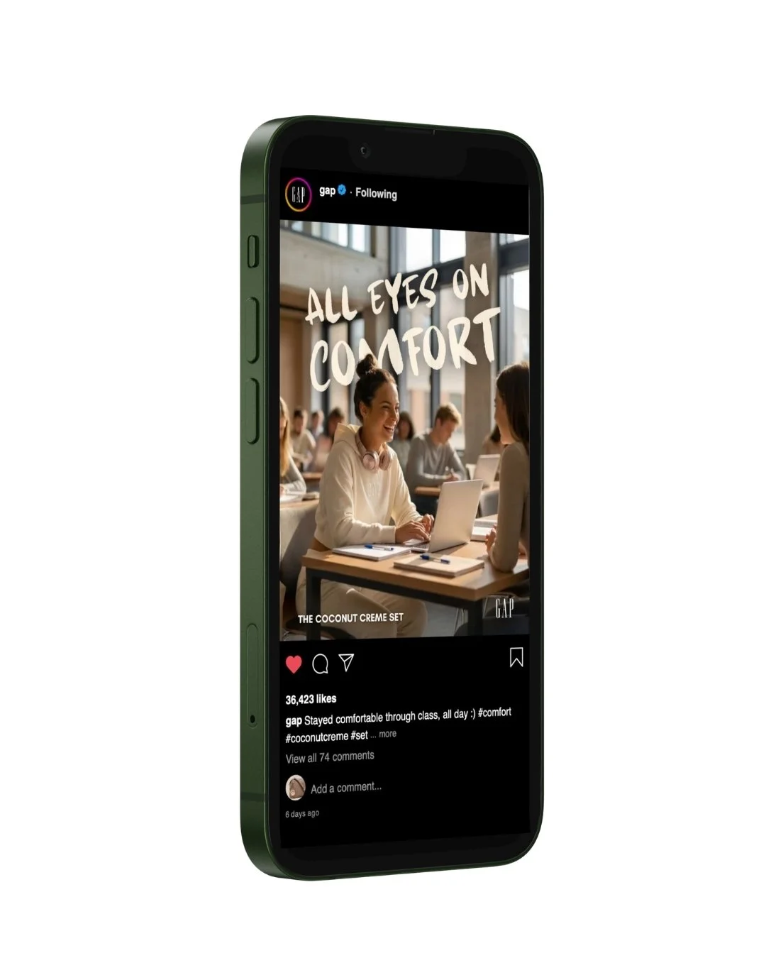
Instagram was used to place the campaign within everyday lifestyle moments, where comfort is both seen and shared. The design leans into soft, monochromatic color palettes, clean compositions, and conversational copy to feel native to the feed while reinforcing a consistent visual system.
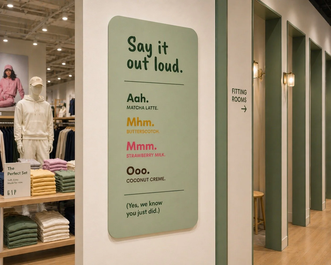
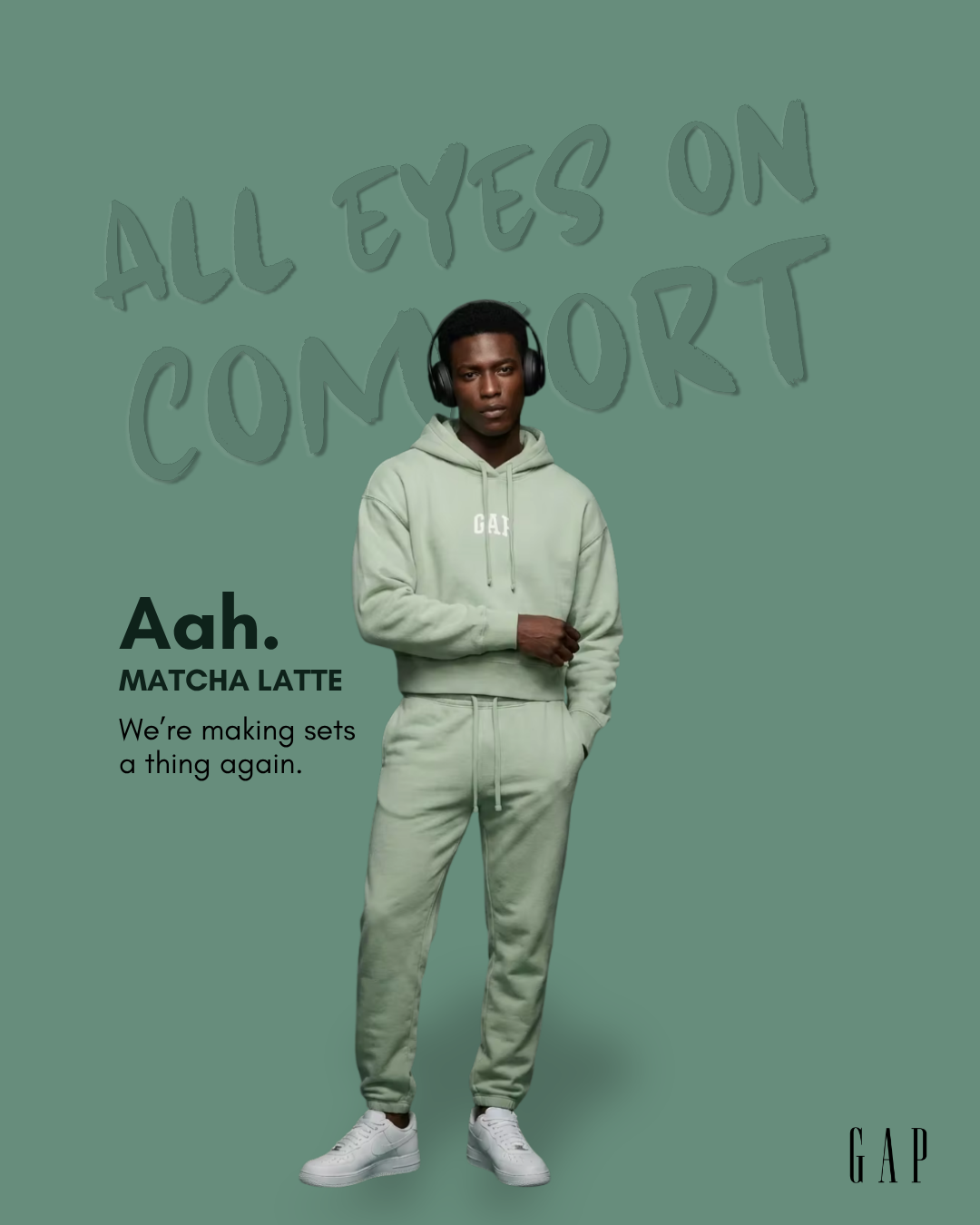
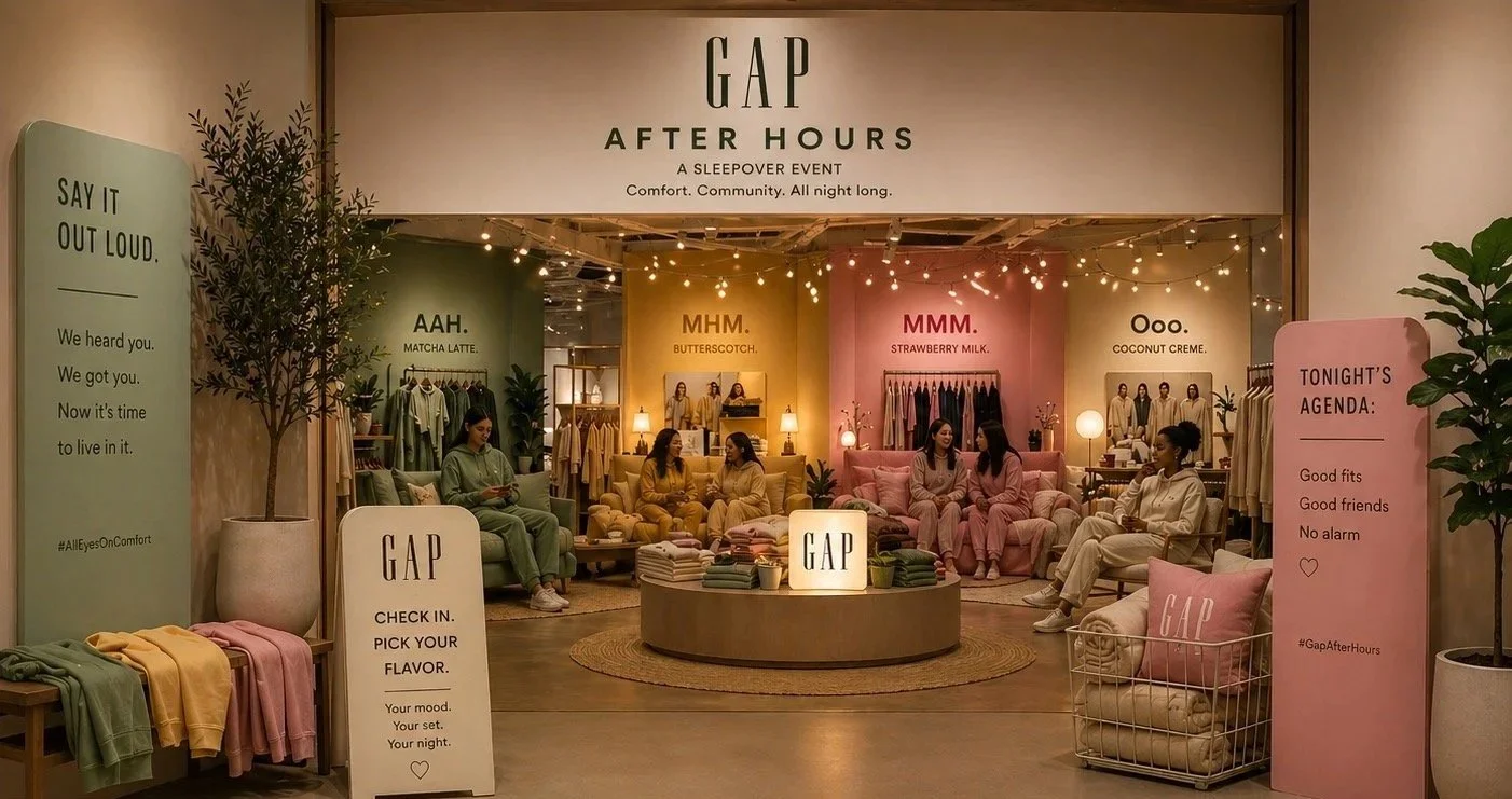
Matcha Latte
ZONE
MOOD
Butterscotch
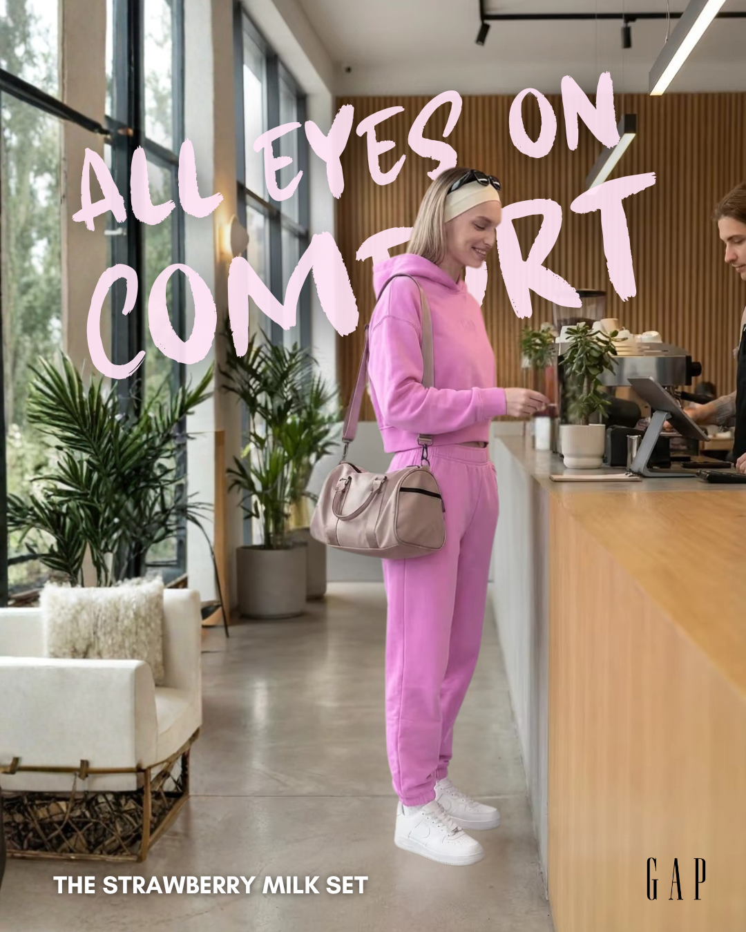
Strawberry Milk
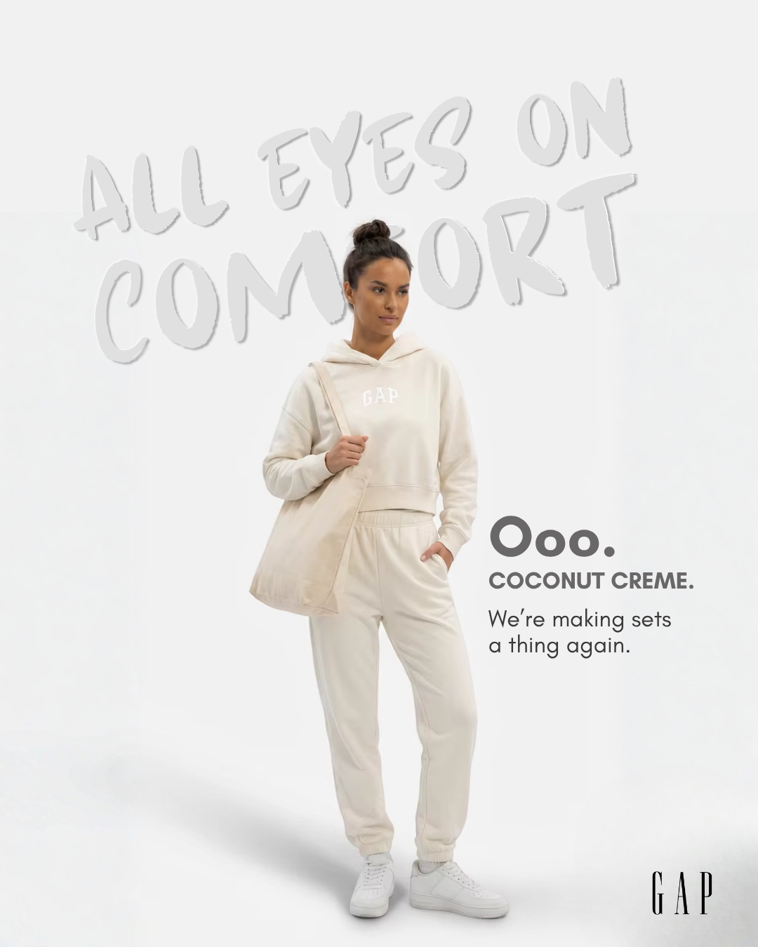
Coconut Creme
Calm
Cozy
Playful
Chill
ACTIVITIES
Matcha bar, journaling station, lo-fi music, quiet recharge space
Movie corner, blankets, popcorn, lounge seating
Games, photo booth, GRWM content, music + social moments
Skincare station, wind-down lounge, deep talks, relaxation area
This event transforms retail into an immersive sleepover experience, bringing the “All Eyes on Comfort” campaign to life through community, content, and personalization. By placing the product in a real, social setting, it turns comfort into something lived, shared, and culturally relevant.
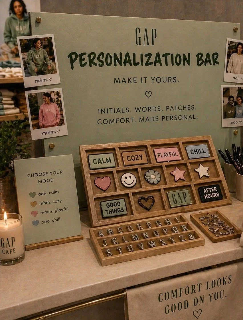
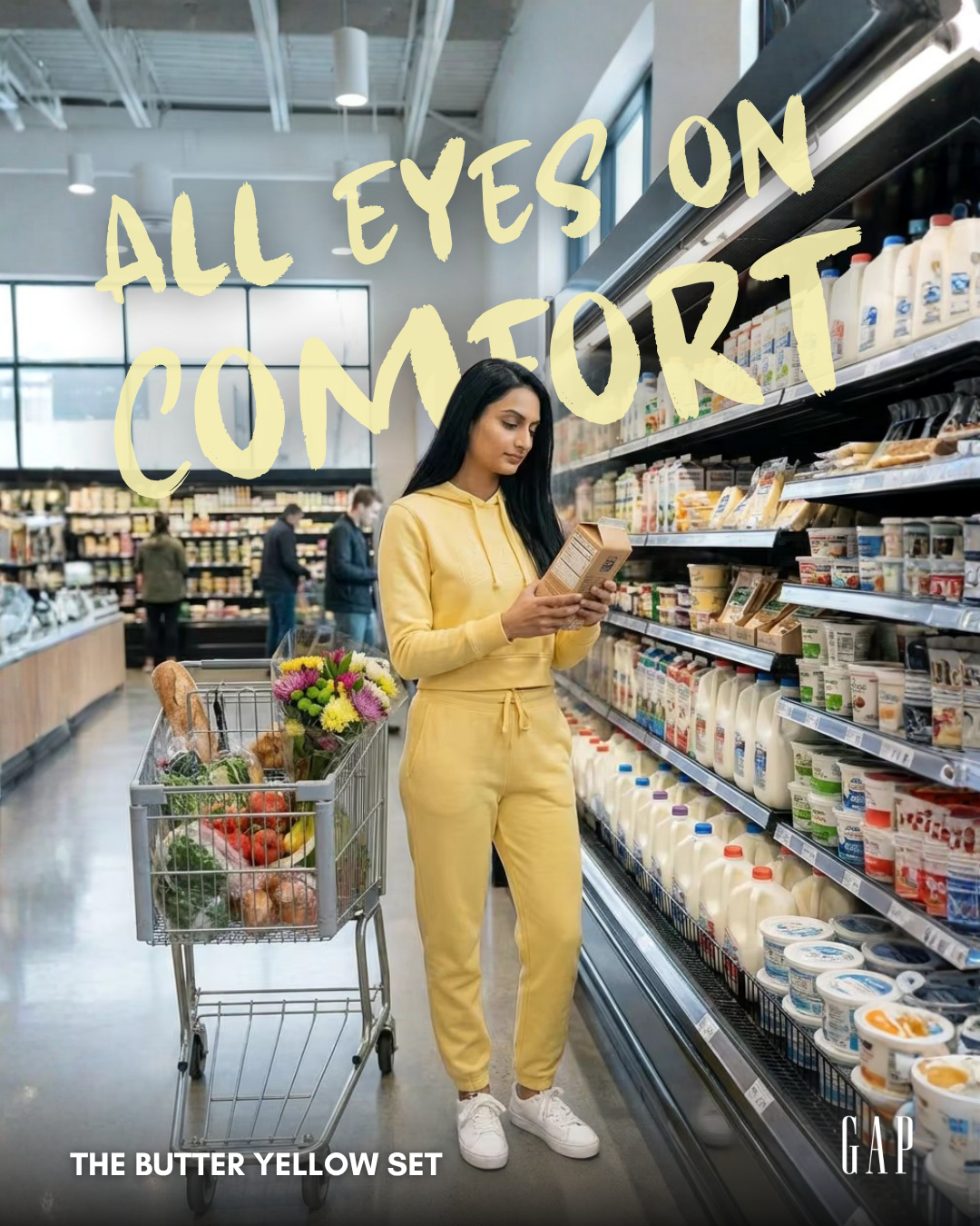
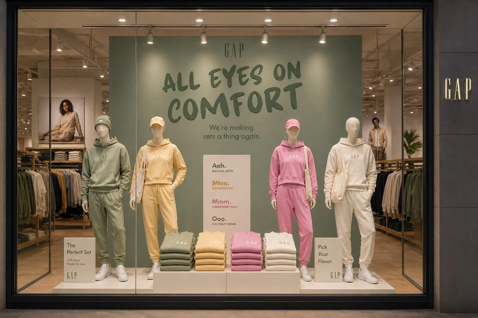
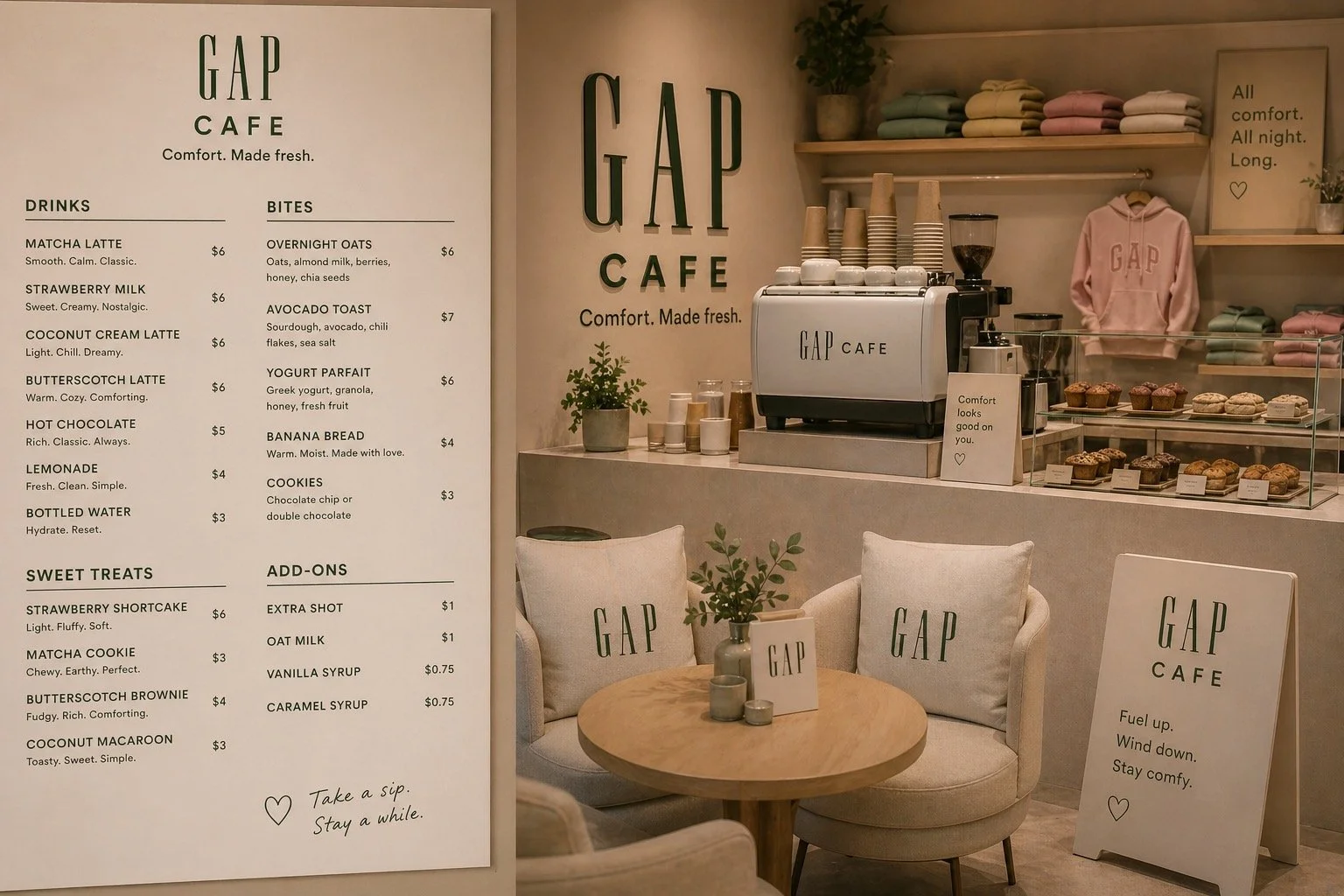
This display brings “All Eyes on Comfort” to life by turning each set into a distinct mood or “flavor.” It invites customers to engage with the product through feeling, not just function, making comfort feel personal, styled, and easy to choose.
Store Display