

Mike’s Hot Honey was often seen as a niche condiment mainly used on pizza, and many young consumers did not realize how easily it could elevate everyday meals. Our campaign repositioned Mike’s Hot Honey as a modern flavor essential using bold, poppy typography and forward-moving visuals that suggested flavor is always evolving. With the tagline “Time moves forward. So does flavor,” we encouraged audiences to keep up or risk being left behind.
Billboard

Placed in high traffic city corridors and commuter highways, this billboard uses bold, quick read typography to capture people on the move and position Mike’s Hot Honey as the modern upgrade flavor that keeps up with today’s pace.
Placed at busy transit stops and pedestrian heavy routes, these ads reach people in everyday moments, using bold humor and quick reads to position Mike’s Hot Honey as the modern flavor upgrade for life on the go.

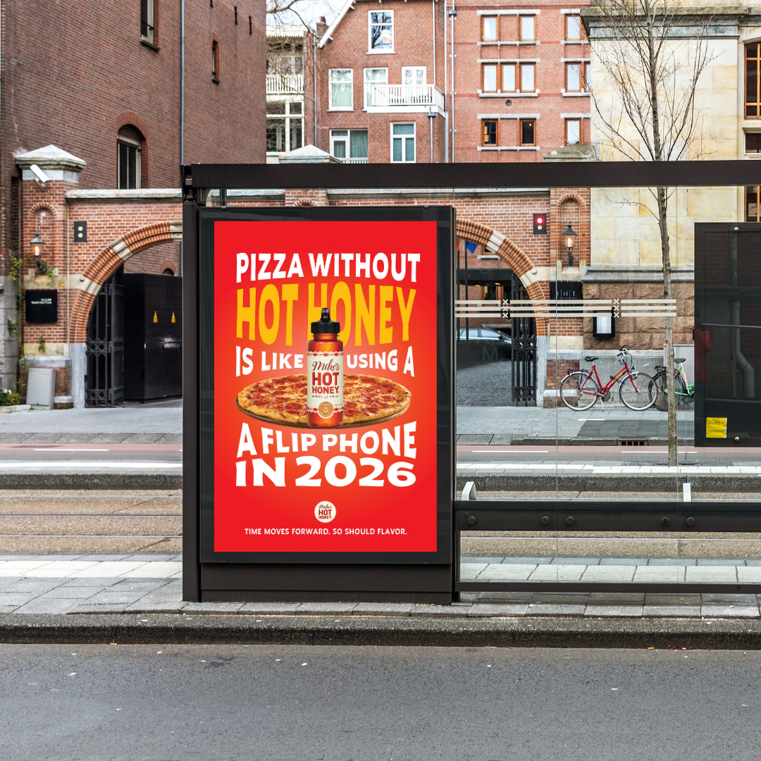
Transit
Transit placements reach people in motion, making them ideal for a message centered around moving forward. The bold color, oversized typography, and simple composition are designed for quick readability at a distance, ensuring the idea lands instantly in high-traffic environments.
Designed for mobile and social platforms, this short reel uses the playful idea of paying with sweet vs spicy to show how Mike’s Hot Honey instantly upgrades everyday moments, encouraging viewers to choose bold flavor with a simple tap.
Instagram Reel
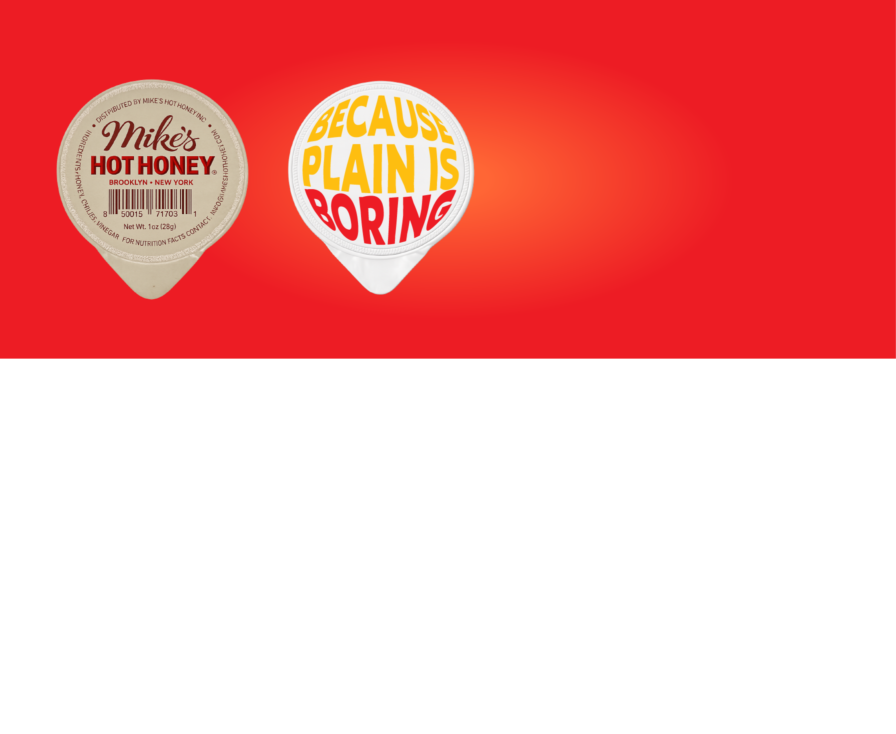
Experiential Activation
Used as an in person activation, these branded dip lids transform a familiar dining moment into a bold reminder that plain is boring, encouraging people to choose Mike’s Hot Honey as the flavor upgrade right at the table.
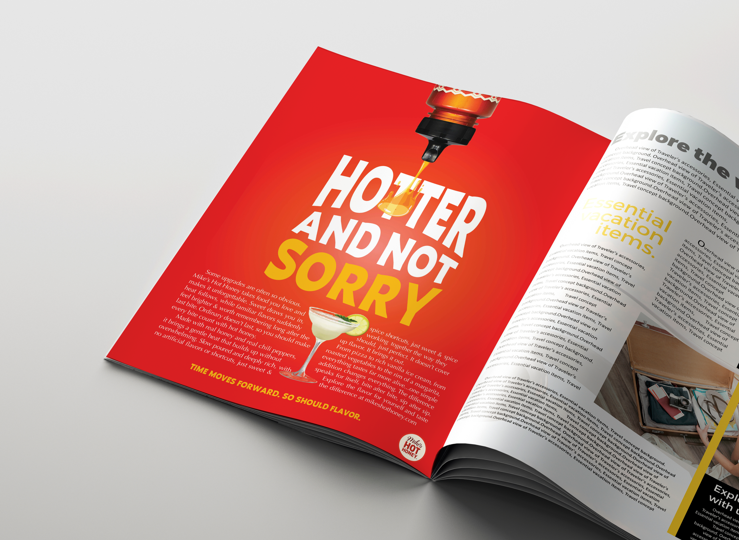
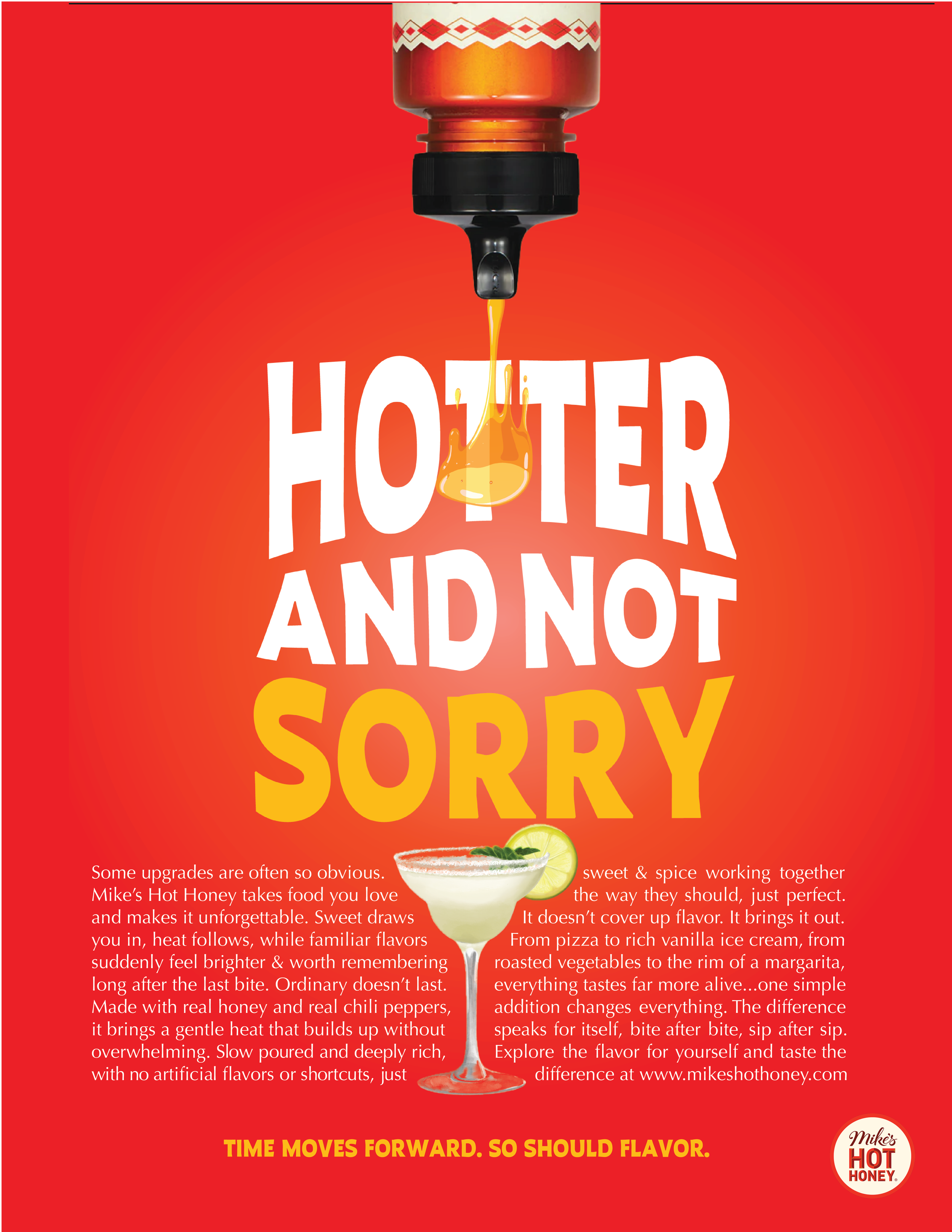
Magazine
Placed in food, lifestyle, and culture magazines, this print ad invites readers to slow down and engage with the story behind the flavor, using bold typography and rich visuals to position Mike’s Hot Honey as a modern upgrade that elevates everyday taste experiences.
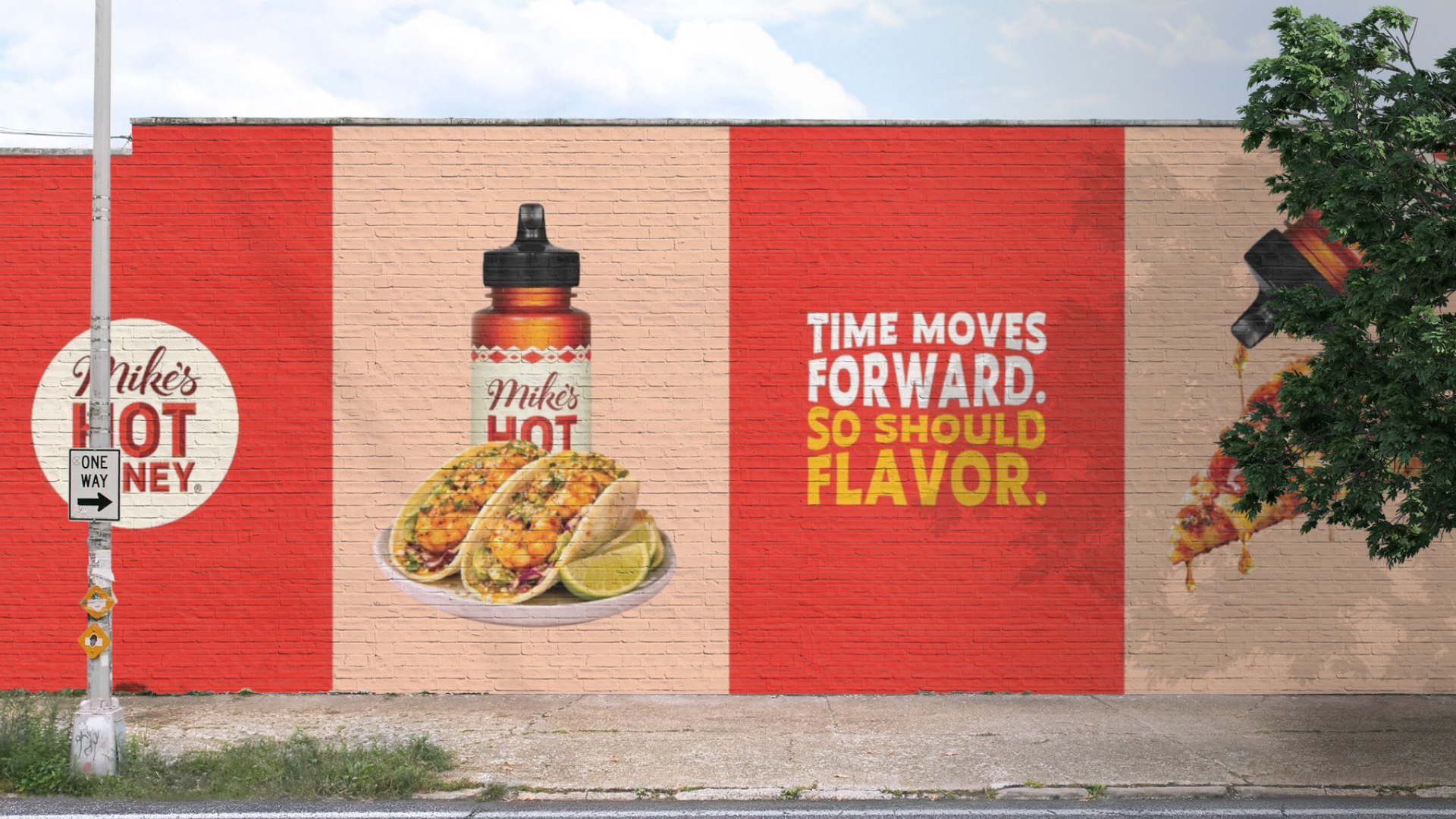
Wall Mural
Placed in high foot traffic neighborhoods and food districts, this wall mural turns everyday streets into bold brand moments, using scale and color to reinforce Mike’s Hot Honey as the flavor upgrade moving culture forward.
Art Direction & Copywriting by Navya Nagpal, Mia DeMattia, and Courtney Mohn